


This brand new marketing campaign for the 2020 season was created to highlight one of the crowning distinctions of a Salt Lake Bees game, the view of the Wasatch Front.
The mountains were hand-drawn based on the backdrop seen from the stadium with the yellow portion representing the front slope of Mt. Olympus feeding into the valley with the black portion representing the Twin Peaks front sloping downward.
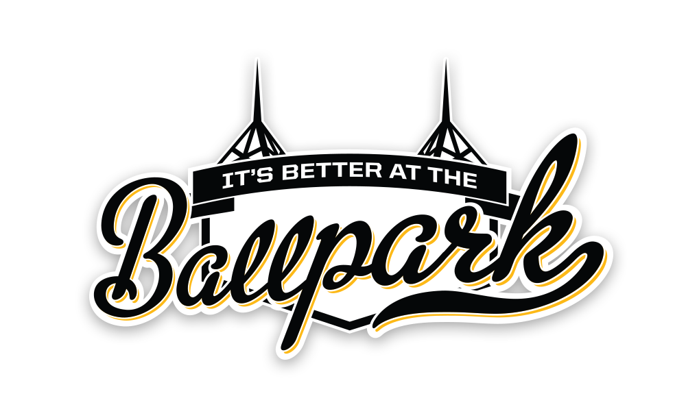
This project was a branding refresh of an existing marketing campaign that has been with the Bees for over six years. The refresh features the iconic spires of Smith’s Ballpark to tie in the location with the idea.
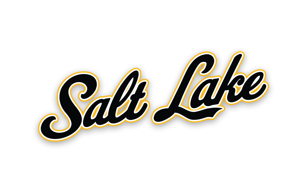
The script Salt Lake has been a rare feature of the Salt Lake Bees branding. In order to promote the idea of “Salt Lake’s Team”, we thought that a new, refreshed, and clean script wordmark was needed. The idea is that this script becomes as synonymous with both Salt Lake and the Bees as the current SL ligature mark dawned across the valley.
This last marketing and branding piece for the 2020 season turns the clock back a century to the original incarnation of the Bees in the 1920’s. The “insect bee” was the original logo of the team and had to be digitally recreated off original images from the period.